I wanted to check out the time of delivery of my new TV. So I followed bol.com's (this is one of the largest retailers in the Netherlands) email to the UPS tracking page, where I could only get information about the *day* of arrival. The UPS tracking page says only that it will be arriving sometime by the end of a day - which is pretty useless information for most of us that have stuff like work/life and want to plan ahead.
So, I decided to try to sign up to their notification service - which is supposed to tell you when anything happens with your delivery.
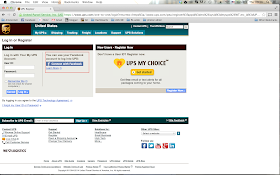
This is the log in or register page:

Great, identity federation - I can log in with my facebook account. or can I?
This is not a software bug - but rather a UX flow defined by UPS. you can tell by the fact that if you drill deeper, you actually find out that the reason for the FB failure is because UPS defines this service only to work if you are in the US, which makes sense, but hey - let me know this before sending me to sign up with my FB Account!
So, after getting the FB error message, I tried to sign up "normally" to a get a UPS account. This required a lot of fast hits on "back" button to prevent the FB error message from poping up again which in itself quite bad. I filled in my details, and guess what?
After hassling the user to fill all his details, once you get to the country field - a dropdown - you discover that you might in fact are lucky enough to have found the most useless dropdown menu in the world! yes, it's a drop down with only one option - US, and you can only tell that after you have clicked on it (of course, by that time you have already spent your precious time on filling in the details of the form.
These are all examples of annoying and bad UX - not only that I could not get an answer to my original question (at what time will my package arrive, more or less), I was mistreated and my time went to waste by trying to sign up for with a malfunctioning registration process (UX wise - the code seems to do what it's supposed to).


No comments:
Post a Comment